

Blending Data in Google Data Studio
Tagged with: Analytics
Google Data Studio is a free reporting platform that you can use to pull from various marketing and other data sources. Since they are made by the same company, Data Studio pulls data from all other major Google platforms – Google Analytics, Google Ads, Google Sheets, Search Console, YouTube, and more – for free. It is also possible to get your information from other large non-Google platforms. Still, you will have to use third-party connectors to access data from Amazon, Bing, Facebook, Pinterest, LinkedIn, Twitter, and others, and most of these, while reputable, are not free.
Since you can pull from many sources, sometimes you will need to show metrics from multiple sources in one table or chart. For example, maybe you want to compare clicks, impressions, and goals between Facebook and Google Ads. A blended data source in Data Studio joins the records in one data source to the records of up to four other data sources. To connect the data, each data source in the blend must share a set of one or more dimensions. There are two main ways to do this.
The quickest and most straightforward way to blend data is to combine two charts:
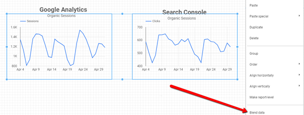
Here we have two charts. On the left, we have Organic Sessions from Google Analytics. On the right, we have Organic Clicks from Search Console. To blend the data on both charts, select both charts by holding shift and left-clicking. Then right-click to open options. Select blend data. This will use the dimension used in the charts – in this case, date – to join the data together.
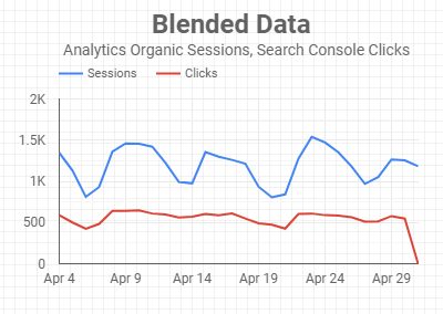
This creates a new chart showing metrics from both sources over the shared dimension. If no dimension is shared, this will not work. This also creates a new data source you can select to use in any graph or table going forward called “Blended Data (x).”
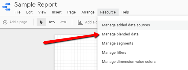
The best way to blend data is to create a blended data source from the resource drop-down or at the source level when looking at settings in a chart:
You can choose up to five data sources to blend, but they must all share at least one dimension with all the other data sources chosen.
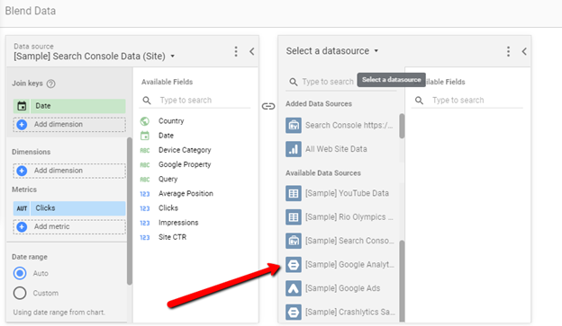
The join key is the most important thing to understand when setting up your data. This joins critical functions like the left outer join from SQL, and blending works similar to Tableau for seasoned data analysts. If there is no value in a metric, it will come through as “Null.”
To put this in simple terms, the function essentially combines data from two sources into a new table and then uses the data in that table to create new tables and charts.
Imagine the following two tables:
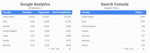
If you wanted to see sessions, pageviews, and clicks by country, then the country would be your join key, and sessions, pageviews, and clicks would be your metrics. You could add goal completions to your data if you would like since you don’t have to use all available information in any one table or graph.
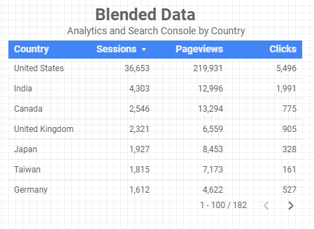
Then we would be able to see this graph:
While you are creating a data source, it can be helpful to rename metrics to Source + Metric (ex. Google Analytics Sessions, Google Analytics Pageviews, and Search Console Clicks) since the name of metrics can overlap. It can be easy to lose track of what metrics come from what original data sources when working with a large amount of data.
It’s important to note that blended data cannot be unblended on charts, tables, or anywhere in report templates after it has been merged. However, original data sources remain intact on their respective platforms throughout the process.
If you need help in your reporting, it can help to outsource to an agency.